

Fundamentals of Composition Plots
Composition plots are the ideal data visualization tools especially when dealing with large amounts of data. Let us take a deeper look into understanding different aspects of composition plots.

As a data science fresher, it can be tricky to know which type of data visualizations to use with which data. To help we’ve put together a few handy articles explaining what each type of data visualization can be used for. Here are some other articles that you might find useful:
Today we’re looking at composition plots, these data visualizations are an ideal way to show a section of data that is part of a whole. There are a few different visualizations that you can use to display data composition -
Pie charts or donut charts help show proportions and percentages for groups.
If you need an additional dimension, stacked bar charts are great.
Venn diagrams are the best way to visualize overlapping groups, where each group is represented by a circle.
In this article, we will take a closer look into understanding the different types of composition plots.
What are Pie Charts?
For data that changes over time, you can use stacked bar charts or area charts. Pie charts illustrate numerical proportions by dividing a circle into slices. Each arc length represents a proportion of a category. The full circle equates to 100%.
For humans, it is easier to compare bars than arc lengths; therefore, it is recommended to use bar charts or stacked bar charts most of the time. It is used to compare items that are part of a whole. Below, we will investigate understanding how household water usage across the world.
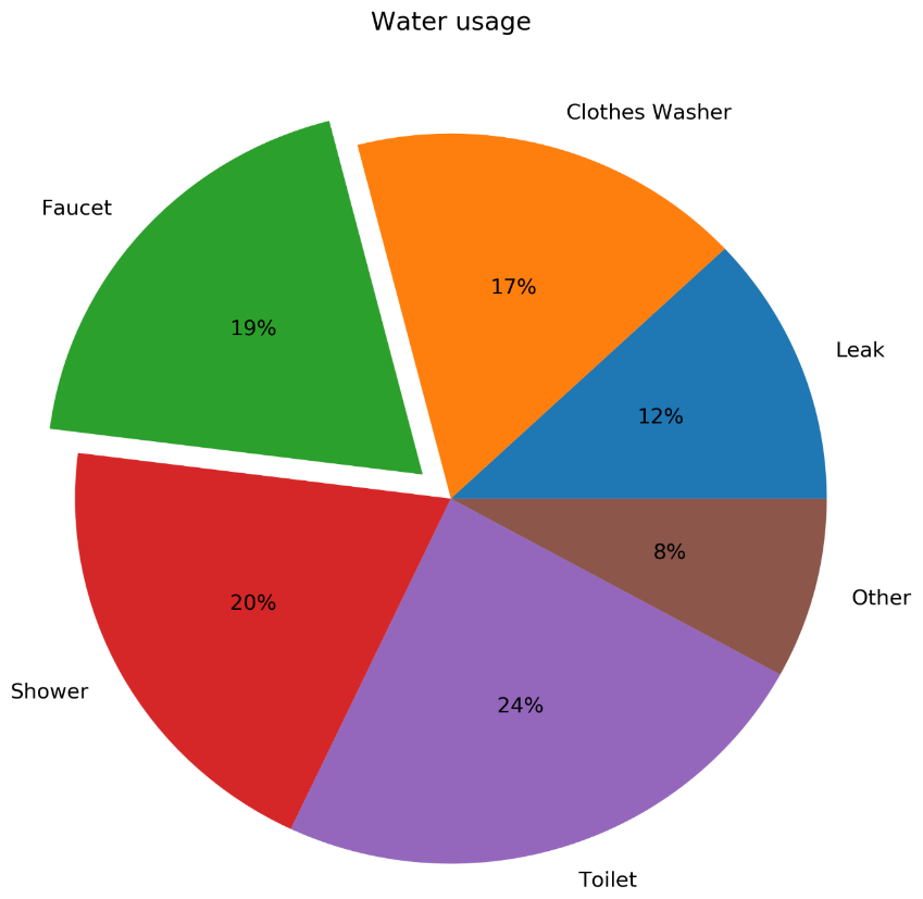
The above chart is a pie chart for global household water usage.
What are some of the best design practices for a pie chart?
Here are some of the best design practices for a Pie Chart:
Arrange the slices according to their size in increasing/decreasing order, either clockwise or counterclockwise.
Make sure that every slice has a different colour.
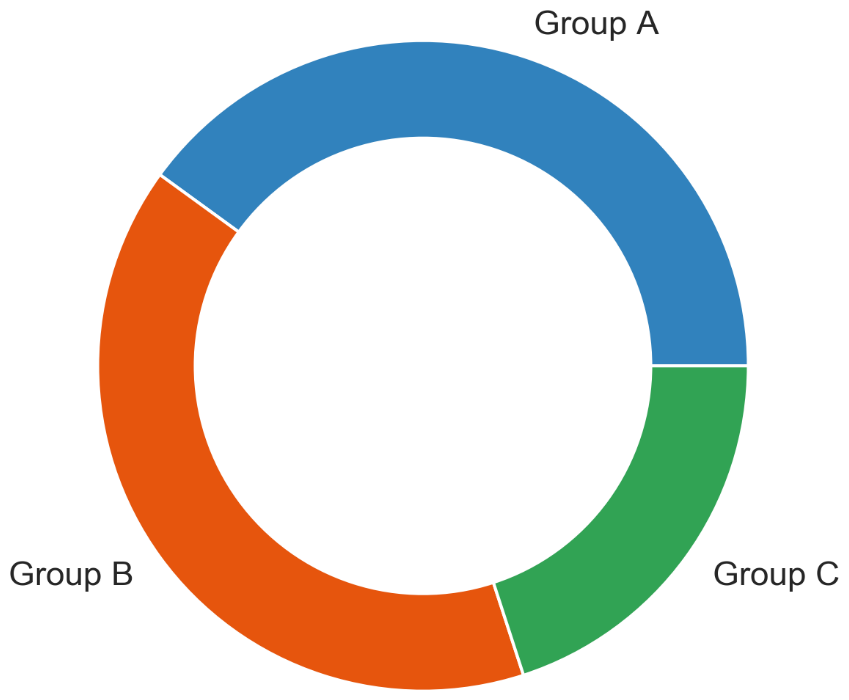
What is a Donut Chart?
An alternative to a pie chart is a donut chart. In contrast to pie charts, comparing the size of slices is easier, since the reader focuses more on reading the length of the arcs instead of the area. Donut charts are also more space-efficient because the center is cut out, so they can be used to display information or further divide groups into subgroups.
The above chart is an example of a Donut chart.
Next, let us look at an example of a donut chart within subgroups.

The above chart is a donut chart with subgroups.
What are the best design practices for Donut Charts?
Here are some of the best design practices for Donut charts:
Use varying brightness levels for the different subcategories.
Use the same colour that’s used for the category for the subcategories.
What is a Stacked Bar Chart?
Stacked bar charts are used to show how a category is divided into subcategories and the proportion of the subcategory compared to the overall category. You can either compare total amounts across each bar or show a percentage of each group. The latter is also referred to as a 100% stacked bar chart. The biggest use of a stacked bar chart is to compare variables which can be divided into sub-variables.
The following diagram shows a generic stacked bar chart with five groups:

A stacked bar chart showing the sales of laptops and mobiles.
The following diagram shows a 100% stacked bar chart with the same data that was used in the preceding diagram:

A 100% stacked bar chart to show sales of mobiles, PCs, and laptops.
What are some of the best design practices for a stacked bar chart?
Here are some of the best design practices for a stacked bar chart:
Use contrasting colours for stacked bars.
Ensure that the bars are adequately spaced to eliminate visual clutter. The ideal space guideline between each bar is half the width of a bar.
Categorize data alphabetically, sequentially, or by value, to uniformly order it and make things easier for your audience.
What is a Stacked Area Chart?
Stacked area charts show trends for part-of-a-whole relations. The values of several groups are illustrated by stacking individual area charts on top of one another. It helps to analyze both individual and overall trend information. The main use of a stacked area chart is to show trends for time series that are part of a whole.
The following diagram shows a stacked area chart with the net profits of Google, Facebook, Twitter, and Snapchat over a decade:
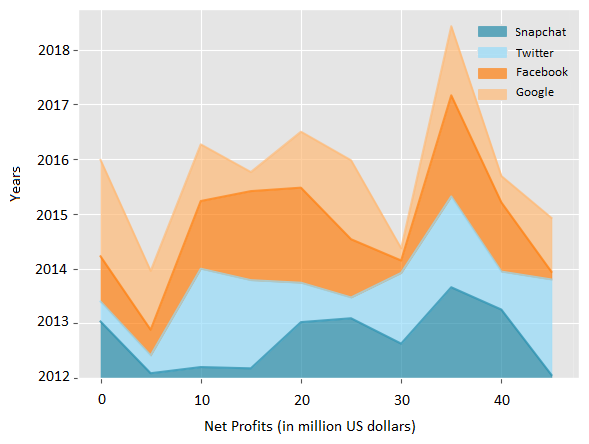
A stacked area chart to showcase the net profits of the companies.
What are some of the best design practices for using a Stacked Area Chart?
Using transparent colours to improve information visibility. This will help you to analyze the overlapping data and you will also be able to see the grid lines. In this section, we covered various composition plots and we will conclude this section with the following activity.
What are Venn Diagrams?
Venn diagrams, also known as set diagrams, show all possible logical relations between a finite collection of different sets. Each set is represented by a circle. The circle size illustrates the importance of a group. The size of the overlap represents the intersection between multiple groups. One of the biggest uses is to show an overlap for different sets.
An example of visualizing the intersection of the following diagram shows a Venn diagram for students in two groups taking the same class in a semester:

The Venn Diagram shows that students are taking the same class.
From the preceding diagram, we can note that there are eight students in just group A, four in just group B, and one in both groups.
What are some of the best design practices of a Venn Diagram?
It is not recommended to use Venn diagrams if you have more than three groups. It would become difficult to understand. Moving on from composition plots, we will cover distribution plots in the following section.
Conclusion:
One of the biggest challenges as a data analyst, or data science fresher is knowing which visualizations to use with which data! If you want to join a community of like-minded freshers, head to our social channels - LinkedIn, Instagram, and Twitter - and follow us for more updates!