

Fundamentals of Relation Plots
Relation plots are the best tools to showcase relationships among different variables.


Relation plots are perfectly suited to showing relationships among variables. They are excellent tools that can be used in visualizing a statistical relationship between various data points. In this blog, we will be looking into the following relation plots -
Scatter plots - visualize the correlation between two variables for one or multiple groups.
Bubble plots - can be used to show relationships between three variables. The additional third variable is represented by the dot size.
Heatmaps - are great for revealing patterns or correlations between two qualitative variables.
Correlograms - are perfect visualizations for showing the correlation among multiple variables.
Let us now understand scatter plots in detail.
What is a Scatter Plot?
Scatter plots show data points for two numerical variables, displaying a variable on both axes.
Uses of Scatter Plot:
You can detect whether a correlation (relationship) exists between two variables.
• They allow you to plot the relationship between multiple groups or categories using different colors.
• A bubble plot, which is a variation of the scatter plot, is an excellent tool for visualizing the correlation of a third variable.
Examples:
The following diagram shows a scatter plot of the height and weight of persons belonging to a single group:
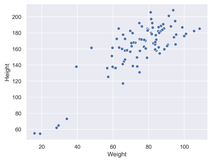
Scatter plots within a single group
The following diagram shows the same data as in the previous plot but differentiates between groups. In this case, we have different groups: A, B, and C:
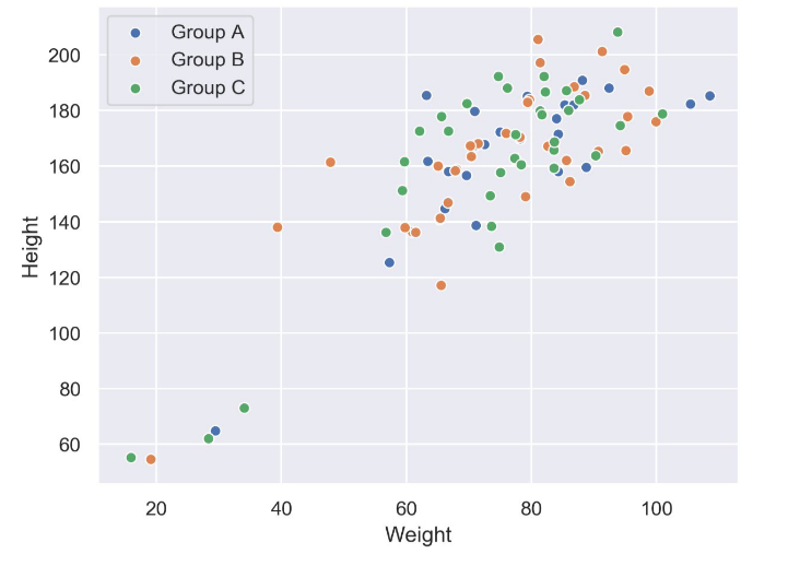
Scatter plot within multiple groups
The following diagram shows the correlation between body mass and the maximum longevity for various animals grouped by their classes. There is a positive correlation between body mass and maximum longevity:
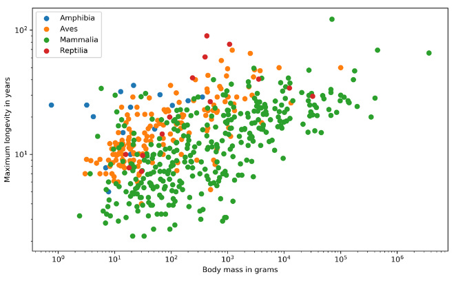
Maximum longevity in years vs Body mass in grams
Design Practices:
Start both axes at zero to represent data accurately.
Use contrasting colors for data points and avoid using symbols for scatter plots with multiple groups or categories.
One of the major variants of scatter plots is marginal histograms. In addition to the scatter plot, which visualizes the correlation between two numerical variables, you can plot the marginal distribution for each variable in the form of histograms to give better insight into how each variable is distributed.
Examples:
The following diagram shows the correlation between body mass and the maximum longevity for animals in the Aves class. The marginal histograms are also shown, which helps to get a better insight into both variables:
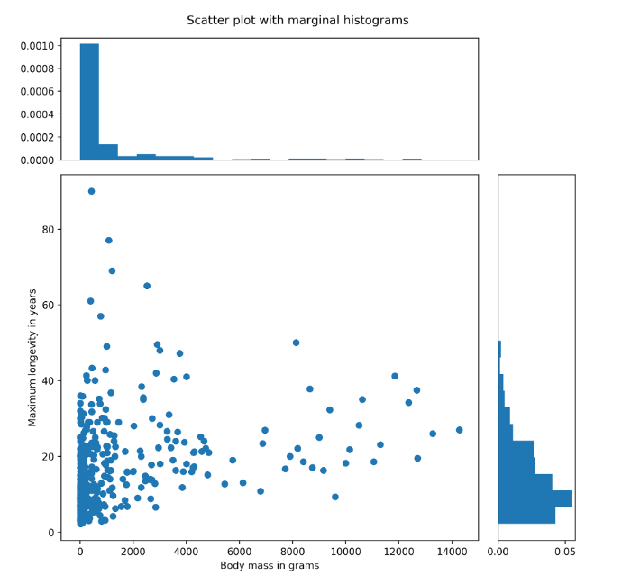
Scatter plot with marginal histograms (Maximum longevity in years vs Body mass in grams)
Correlation between body mass and maximum longevity of the Aves class with marginal histograms.
Next, let's take a look at Bubble plots in detail.
What is a Bubble Plot?
A bubble plot extends a scatter plot by introducing a third numerical variable. The value of the variable is represented by the size of the dots. The area of the dots is proportional to the value. A legend is used to link the size of the dot to an actual numerical value.
Use of Bubble Plots:
Bubble plots help to show a correlation between three variables.
The following diagram shows a bubble plot that highlights the relationship between the heights and age of humans to get the weight of each person, which is represented by the size of the bubble:
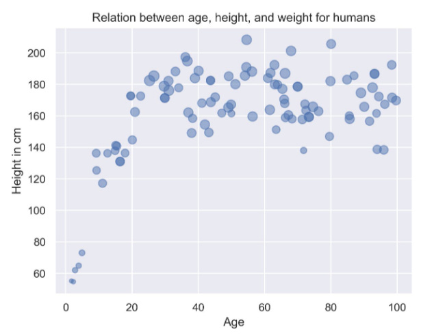
Bubble plot showcasing the relation between age, height, and weight for humans
Design Practices:
The design practices for the scatter plot are also applicable to the bubble plot.
Don’t use bubble plots for very large amounts of data, since too many bubbles make the chart difficult to read.
Next, we will look into understanding correlograms and how they work.
Correlogram
A correlogram is a combination of scatter plots and histograms. A correlogram or correlation matrix visualizes the relationship between each pair of numerical variables using a scatter plot. The diagonals of the correlation matrix represent the distribution of each variable in the form of a histogram. You can also plot the relationship between multiple groups or categories using different colors. A correlogram is a great chart for exploratory data analysis to get a feel for your data, especially the correlation between variable pairs.
Examples:
The following diagram shows a correlogram for the height, weight, and age of humans. The diagonal plots show a histogram for each variable. The off-diagonal elements show scatter plots between variable pairs:
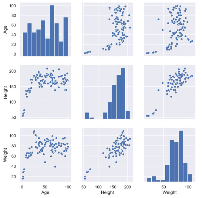
Correlogram within a single category such as age, height, and weight
The following diagram shows the correlogram with data samples separated by color into different groups:
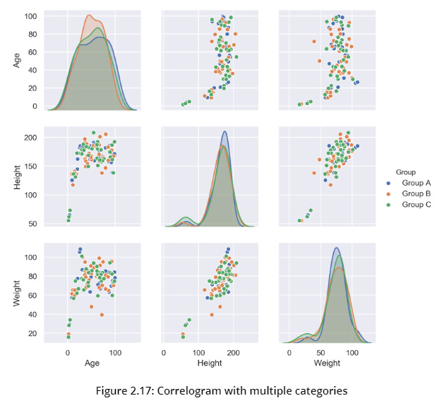
Correlogram with multiple categories like age, weight, and height
Design Practices
Start both axes at zero to represent data accurately.
Use contrasting colors for data points and avoid using symbols for scatter plots with multiple groups or categories.
Finally, we will be looking into understanding heatmaps.
Heatmap
A heatmap is a visualization where values contained in a matrix are represented as colors or color saturation. Heatmaps are great for visualizing multivariate data (data in which analysis is based on more than two variables per observation), where categorical variables are placed in the rows and columns and a numerical or categorical variable is represented as colors or color saturation.
Uses of Heatmaps
The visualization of multivariate data can be done using heatmaps as they are great for finding patterns in your data.
Examples
The following diagram shows a heatmap for the most popular products on the electronics category page across various e-commerce websites, where the color shows the number of units sold. In the following diagram, we can analyze that the darker colors represent more units sold, as shown in the key:
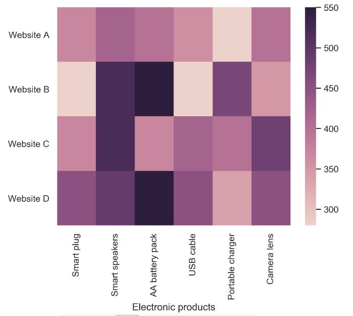
Heatmap for popular products in the electronics category
Variants
Annotated Heatmaps Let’s see the same example, where the color shows the number of units sold:
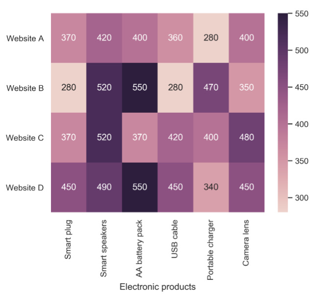
Annotated heatmap showcasing the number of units sold.
Design Practice
Select colors and contrasts that will be easily visible to individuals with vision problems so that your plots are more inclusive.
Conclusion
We hope this guide to relation plots has helped you to understand that no matter what data you have there is a relation plot that can help you visualize your findings.
To help build your confidence and experience we recommend finding a dataset that looks interesting and then using it with each of these relation plots. The best way to see if it's the right plot to use with that type of data is through experimentation. Once you've practiced this a few times you're one step closer to your data science dream!